
Kelmscott Manor is a Museum that feels like a private house, but Rodmarton Manor, curiously enough, is a private house that feels like a museum. The interiors feel oddly unlived in, even though the sofas (a sure sign of inhabited houses) are comfortably daggy. There are really only three main rooms, the middle one of which is rather too big to be cosy (with two fireplaces). The furniture pieces are all by Arts and Crafts architect-craftsmen—Gimson and Co.—and are much more refined than I imagined them to be. The rustic vernacular has been refined to an aristocratic level, as precious as the Rococo. The itinerary of the house enters from The Circle, crosses a hall, goes through the three large rooms, then up the stairs to a series of rather unlived-in bedrooms above the main rooms, and then down to the chapel at the west end, then back through the corridor. Photography in the house was not allowed, so my account of this is necessarily sketchy.
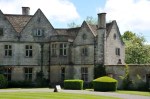
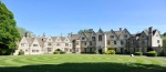
The garden is much more extensive than I expected, and the publications I had read did not give a very good idea of what the property was like. The only useful plan I known is by Simon Dorrell in Judith B. Tankard’s The Gardens of the Arts and Crafts Movement (p. 59). The car park is at the side of the holly drive. Then comes the stable yard, which spills you out into The Circle under leafy shade trees (Fig. 4). The full view of the façade with its multiple gables emerges after a moment, although the vastness of The Circle with its concentric mowing rings is the dominant feature. It was designed ‘to look like a series of cottages on a village street’ (Tankard, p. 56), which is rather odd in a country house. As a result the façade is quite hard to read. The gables are too regular to be a village street and not regular enough for a house, as well as being the wrong pitch. Nevertheless, the main entrance is clearly signalled by a bay that projects further than the others and whose gable is out of step with the others (Fig. 5).
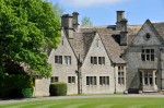
On looking more closely at the triple gables to the left (Fig. 6), these emerge as being more symmetrical than at first appear, as is established by the symmetrical bay windows, not to mention the two topiary loaves of bread flanking the entrance. The entranceway is modest, but again is clearly signalled, with a little cap-shaped drip moulding. The left gable, unlike the one at the right, continues down below the cornice, in a way that it a little Lutyens-like but without his energy. Likewise the main unit (Fig. 7) proves on closer inspection to be symmetrical around the central projection, with five gables in all, and two-storey polygonal bays at either end that help to disguise the change in orientation to the triple gable unit and the chapel wing (Fig. 8).
At the far left is further two-gable unit (Fig. 9), which has nothing corresponding to it on the other side other than the garden wall. Being lower than the three gables, these signal a lesser place in the hierarchy (Fig. 8). These have a calculated asymmetry in the lower windows and a transition section which effects the change of angle in plan, not this time with the polygonal hinge-like element, but with short section that rams into the front face of the wall below the first of the three gables.
Overall (Fig. 10) the building proves to have an artful asymmetry. Its underlying logic is distinct from the Gothic picturesque; the variations between components is much more calculated, more syncopated. In its intellectuality Lutyens comes to mind, but Lutyens is always more genuinely picturesque, and with a better grasp of what individual forms—gables and windows—can do. In some ways it is almost Palladian or Baroque, but there is a refusal to separate the components that we find in that those styles, not to mention the asymmetry of the whole.
-
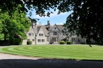
- Fig. 4
-
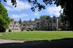
- Fig. 5
-
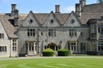
- Fig. 6
-
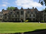
- Fig. 7
-
- Fig. 8
-
- Fig. 9
-
- Fig. 10
