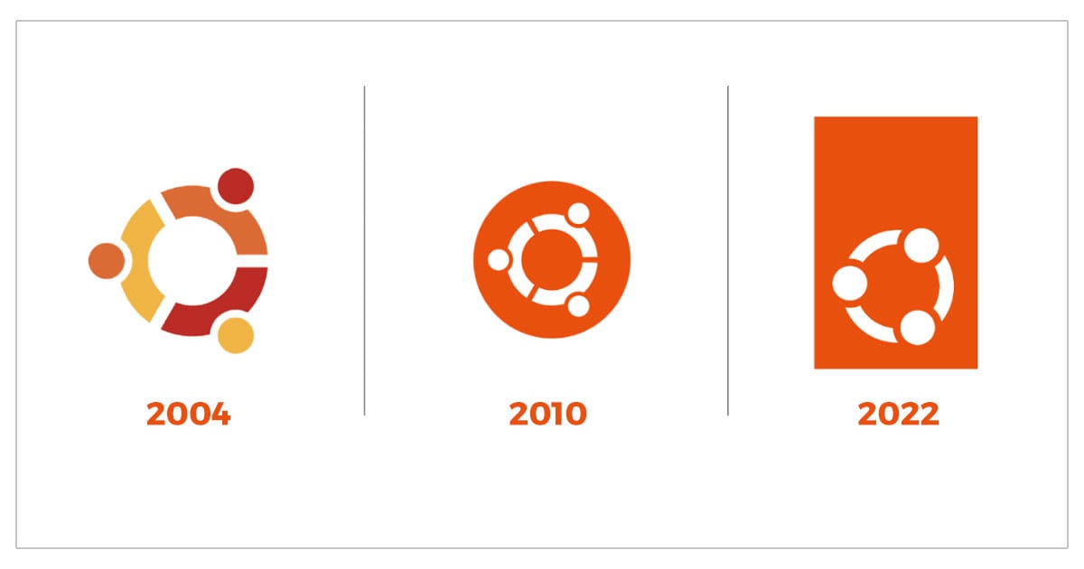
Last summer I teased that a new Ubuntu logo was on the way — today that logo was made official.
Don’t panic too much; Ubuntu’s new logo still uses the orange and white colour scheme we’re all familiar with. But the iconic Circle of Friends (CoF) motif? Well that is different, sporting a tighter and more unified look than in its earlier iterations.
Perhaps most strikingly of all is that the CoF no longer sits inside a circle (’roundel’ in design speak) but is now housed at the bottom of a solid orange rectangle:
I previously described the new CoF as a “huddle”, noting that it’s a “powerful and emotive representation of the interdependency that Ubuntu has as an OS, platform, community, project”. Rather than holding hands, the people in the new logo appear to be linking arms. It’s more intimate embrace.
“While it is important to have a respectful continuity with the previous Circle of Friends, the updated version is leaner, more focused, more sophisticated,” Canonical says of the its new design, which it adds is more of an ‘evolution’ rather than an out-right revolution.
“It also makes a little more sense that the heads are now inside the circle, facing each other and connecting more directly.”
The new Ubuntu logo is also more prominently displayed within the Ubuntu logo mark. It migrates from being a superscript dot on the right-hand side to a more dominant strip on the left:
The Ubuntu word mark also thins down its bold font weight to a lighter, sleeker one, uppercasing the ‘U’ in ‘Ubuntu’ as part of the process.
Why did Ubuntu change its logo?
Why revamp the logo at all? Ubuntu last underwent a rebrand in 2010. But Canonical reasons that since Ubuntu and the technologies that underpin it evolve over time, so too should the brand that represents it.
I’d say that’s fair; there is nothing wrong with the old Ubuntu logo to my eyes (it’s certainly not as dated-looking as the original CoF from 2004) but I can’t argue that a bit of attentive upkeep is healthy. It helps keep things fresh and pacy.
Ubuntu’s new logo was designed by the same person as the 2010 revamp, Marcus Hallam. He explains that although he and Canonical CEO Mark Shuttlworth explored some ‘left-field’ ideas explored they ultimately felt “…updating the Circle of Friends to a more contemporary look and feel” made the most sense.
You can see an animation for the new logo in this video:
Let me know what you think of it down in the comments.


